Case Study · AutoScout24 · Search & Discovery
New Make & Model
Turning richer vehicle data into a buyer decision.
AutoScout24 could describe cars by make, model group, generation, variant, and motor. Buyers still entered through two familiar dropdowns: make, then model. The data could distinguish a BMW 330d Touring or a Golf GTI with more precision than the interface could show.
- Role
- UX Lead for the make/model experience
- Scope
- Buyer-facing web interaction, Germany car marketplace
- Status
- Germany launched; wider rollout under way
- Evidence
- Four design models and repeated production testing

I led the buyer-facing make/model experience, from hierarchy and search paths to multi-select and the move from dropdowns into a larger modal.
The Constraint
A deeper taxonomy outgrew two dropdowns
The data could describe precise vehicle intent, but the existing interaction could not help buyers express it without learning the system underneath.
The legacy flow worked while model names carried most of the useful meaning. The new structure let buyers stop at a make or continue into a specific generation and engine.
Buyers did not follow one path through those levels. Some knew the exact term. Others recognised a generation or body shape from an image. Long names and several valid combinations competed for limited space on mobile web.
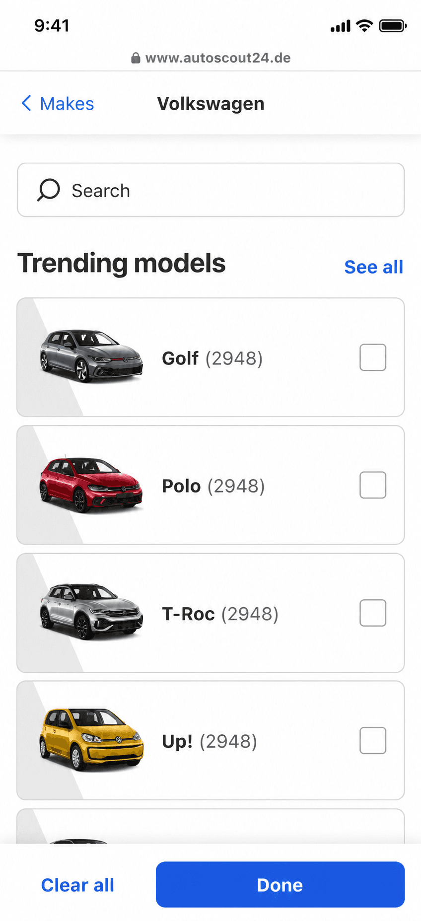
I organised and facilitated a kickoff workshop with key stakeholders. We aligned on three risks: imprecise results, hard-to-compare vehicles, and extra steps. I carried that framing into Concept24, an early vision prototype that used images and step-by-step refinement. It made the direction tangible before we tested how it could work inside the existing filter.
Early vision prototype
Design Evolution
Four interaction models changed the direction
Each model exposed a different cost and changed the next design.
Model 01
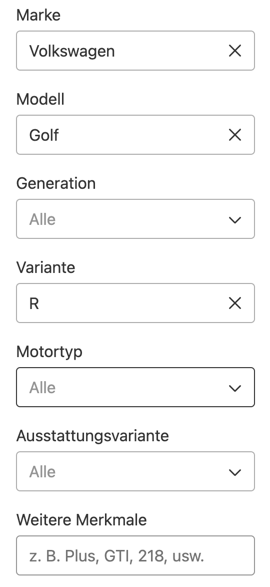
Six dropdowns exposed the data model
The first model gave each taxonomy dimension its own dropdown. Buyers faced unfamiliar labels and six steps before they could review a choice. We had put our data structure on screen.
Model 02
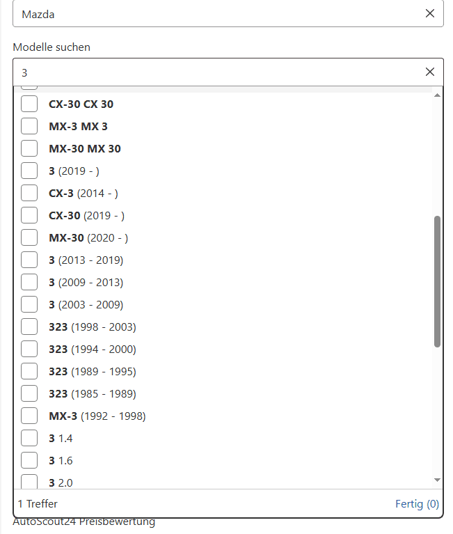
Search inside a familiar shell hid too much
We returned to a familiar make/model form and added search across the hierarchy. Long combinations were hard to compare, selections had no stable home, and mobile scrolling separated the query from results.
Model 03
More room for a deeper taxonomy
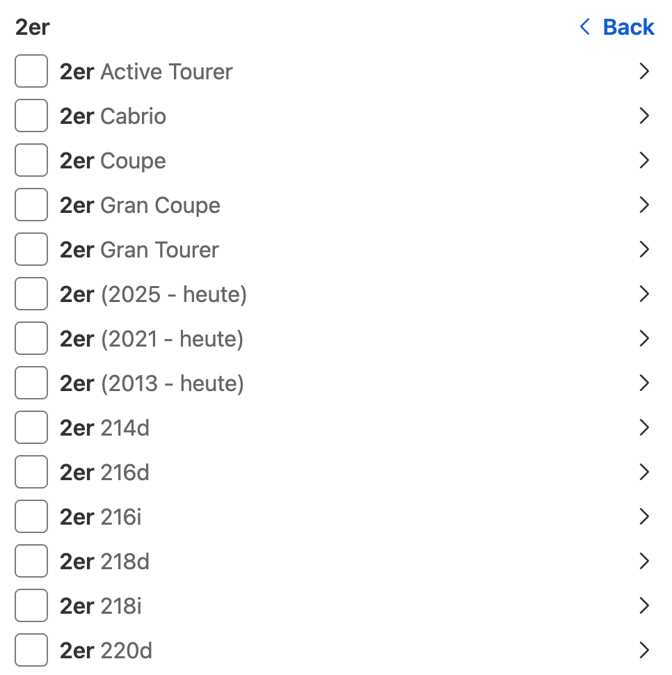
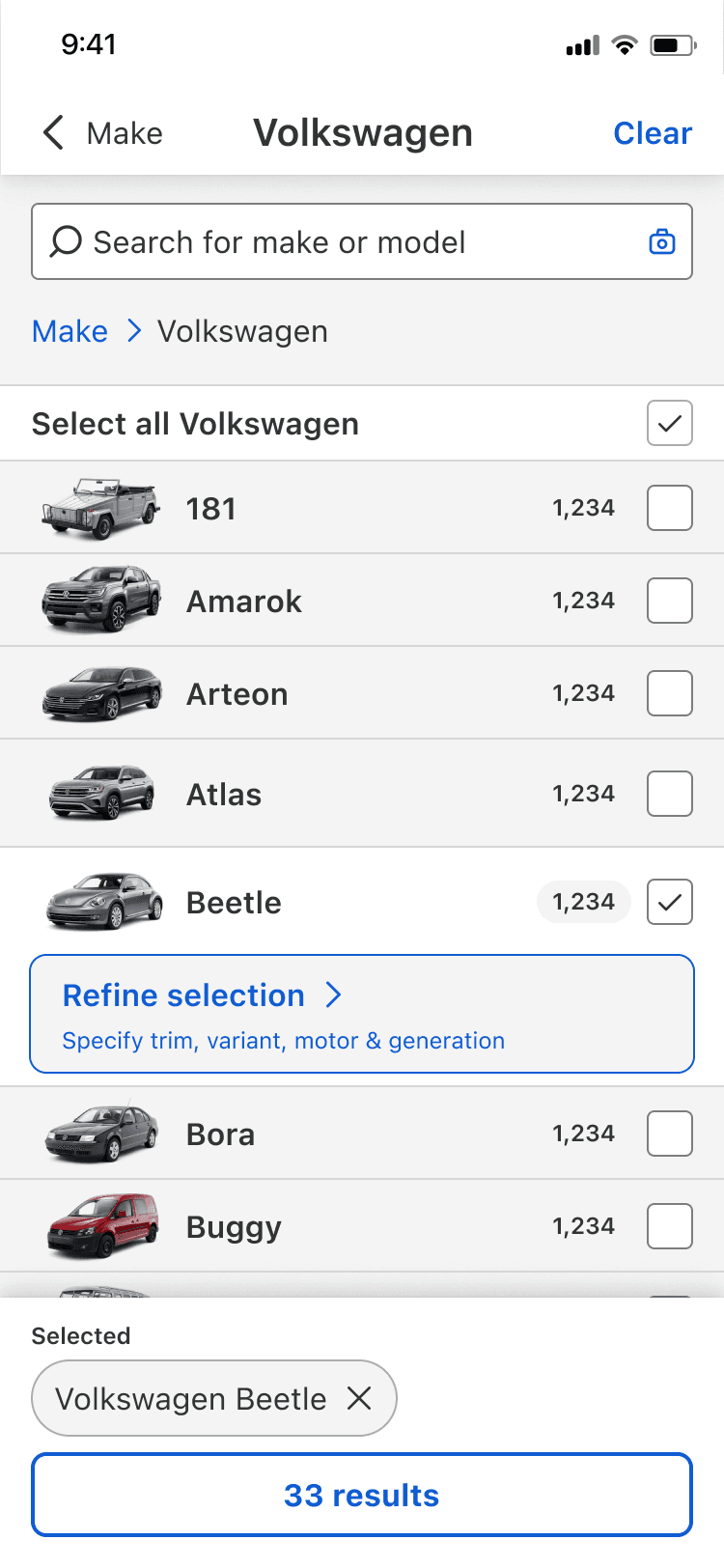
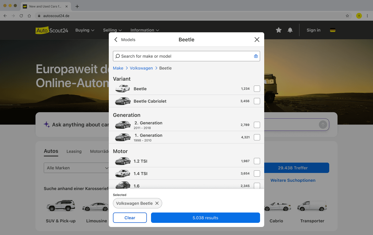
I moved the experience out of the dropdown and into a modal on desktop and a full-screen view on mobile web. Buyers had more space to browse, compare options, and see where they were in the hierarchy. We had found the right container, but asking buyers to move through every level still took too many steps.
Deep drill-down
Full-screen mobile web
Model 04
Grouped choices reduced the depth
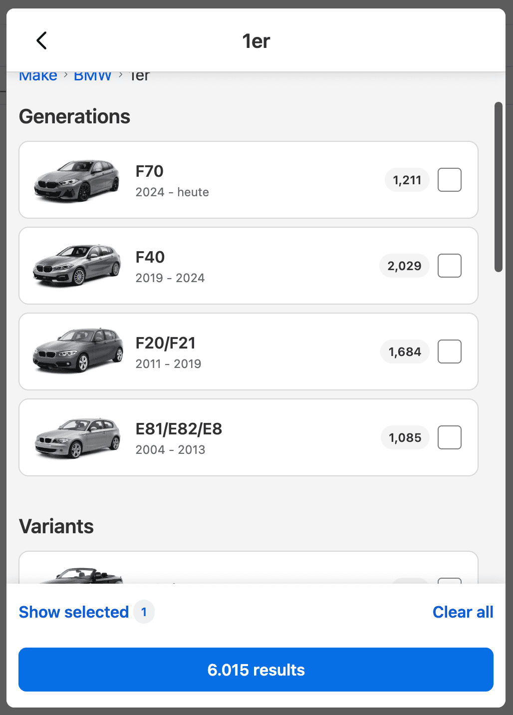
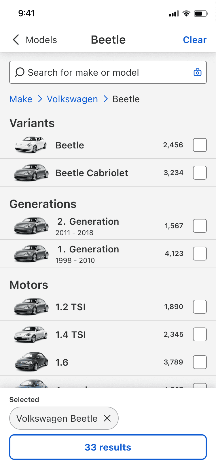
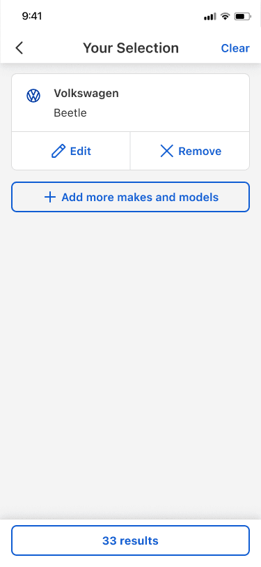
I kept the modal and grouped generations, variants, and motors on one screen. Titles and subtitles made long combinations easier to scan. A selection drawer gave buyers one place to review, remove, or revisit choices. We took this model into final testing.
Supporting decisions
Buyers could type or browse
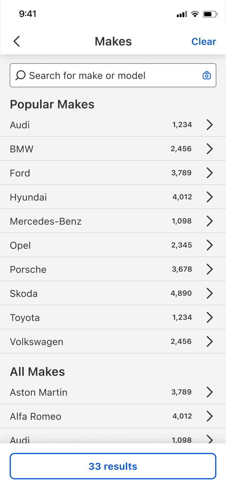
A buyer could type Golf GTI or start with Volkswagen and browse. Both routes opened the same refinement view, where broad and precise choices remained valid. I designed that handoff. Search Relevance specialists owned matching and ranking.
Images helped buyers tell similar vehicles apart
Text labels alone made generations and body styles hard to tell apart. Image and data specialists used dealer-photo references and generative AI to create consistent thumbnails. I designed how they appeared in the hierarchy and selection flow.
How the final interaction works
Browse
Refine
Review
The Foundation
New Search provided the foundation
The web search reset introduced a reusable modal. I used that responsive surface for the deeper make/model decision.
Preceding case study
New SearchHow we reset search and filters across apps and web before tackling the deeper vehicle hierarchy.
Evidence
Six rounds of testing shaped the final interaction
We ran six rounds of A/B testing. Smaller changes within those rounds helped us separate problems with the interface from problems with vehicle language and response time.
We used research sessions to check whether buyers understood the interaction and production behaviour to see whether it held up in a live search journey. We used both when choosing the next change.
Question 01
Finding the right container
- Question
- Could a familiar dropdown contain the richer hierarchy?
- What changed
- Six fields exposed the data model. Search in a compact shell made long results and selection state difficult to manage.
- Design decision
- Use the New Search modal as a dedicated make/model surface.
Question 02
Reducing interaction depth
- Question
- How much of the hierarchy should buyers have to traverse?
- What changed
- Deep drilling revealed the structure but required too many steps and made partial selections harder to review.
- Design decision
- Group related choices on one screen while allowing broad selections to remain valid.
Question 03
Building trust in a live journey
- Question
- What made the interaction feel dependable in production?
- What changed
- The team adjusted entry cues, navigation, selection review, re-entry, and response time inside the larger tests.
- Design decision
- Stabilise the grouped interaction and introduce it through a staged rollout.
Response time also changed how buyers read the interface. Slow updates made clear labels and navigation feel unreliable, so design and engineering reviewed the journey again after improving the system response.
Launch
Rolling out from Germany
Cars in Germany launched first through a staged release. After confirming the interaction was stable, the team began rolling the richer taxonomy and image experience out across AutoScout24's remaining web markets.
My Role
I led the buyer-facing experience
I led the design from the first dropdown concepts through the grouped modal. My work covered how buyers searched or browsed, managed several choices, and returned to edit them. Product, engineering, data, and rollout partners owned the wider programme, experiments, implementation, and market delivery.
On complex systems, I now start with the decision a person needs to make and show only the structure that helps. Here, that meant supporting exact search and visual browsing without forcing buyers through the full taxonomy.